


Press
Colour is trumps: Bette, the king of colour
From a stylistic point of view, the modern is characterised by purist design, minimalist design language - and clear dominance of the colour white. Why? Because the effect of a product is decisively dependent upon the design and colour from a formal/aesthetic point of view. For many architects, interior designers, planners and end customers, the choice of colour is even one of the main tasks involved in the design process – and things are no different in the bathroom.
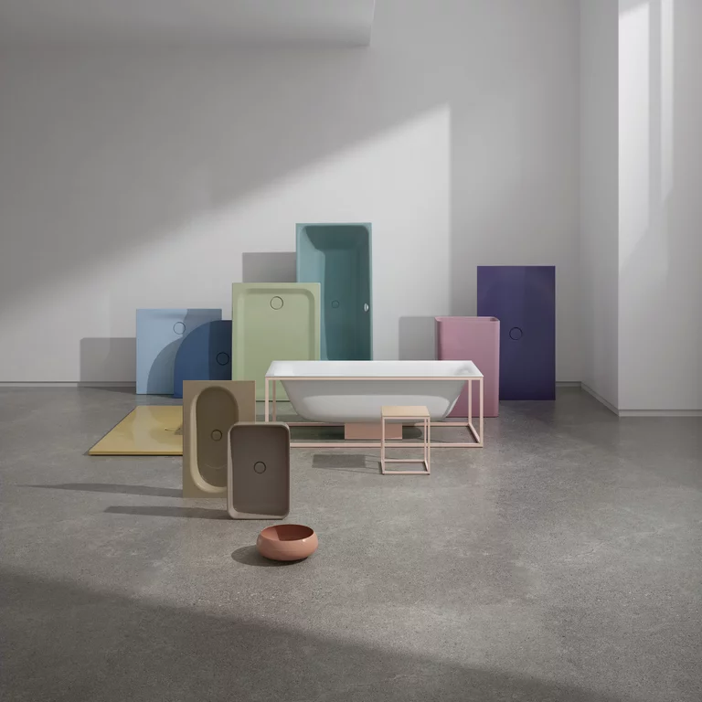
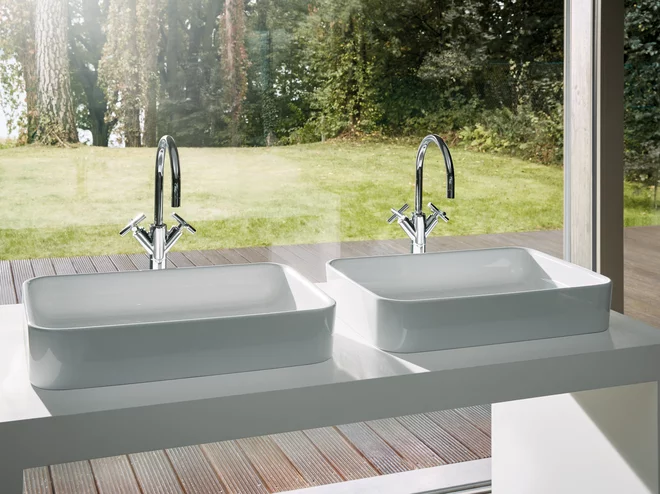
The award-winning design language and the company's modern and effect-laden colour palette are proof of the fact that Bette is one of the top companies with regard to design management and colour diversity. As well as having a wide range of classic sanitary and matt colours, it also includes glittering and excitingly shimmering colour shades.
Colour is life
The theory of colour and shape was an essential training module, even at Bauhaus. Artists and architects such as Kandinsky, Itten and Le Corbusier made intensive use of Goethe's colour theory, and ensured that colour became an indispensable part of modern life. Sven Rensinghoff, marketing manager at Bette: "The pioneer of the colour theory at Bauhaus was Johannes Itten, who not only dealt intensively with the interaction of different shapes and colours, but also experimented with them. To us at Bette he is a role model and inspiration, and colour is a decisive element in our design process."
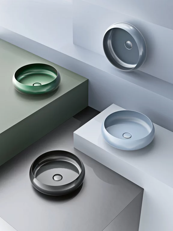
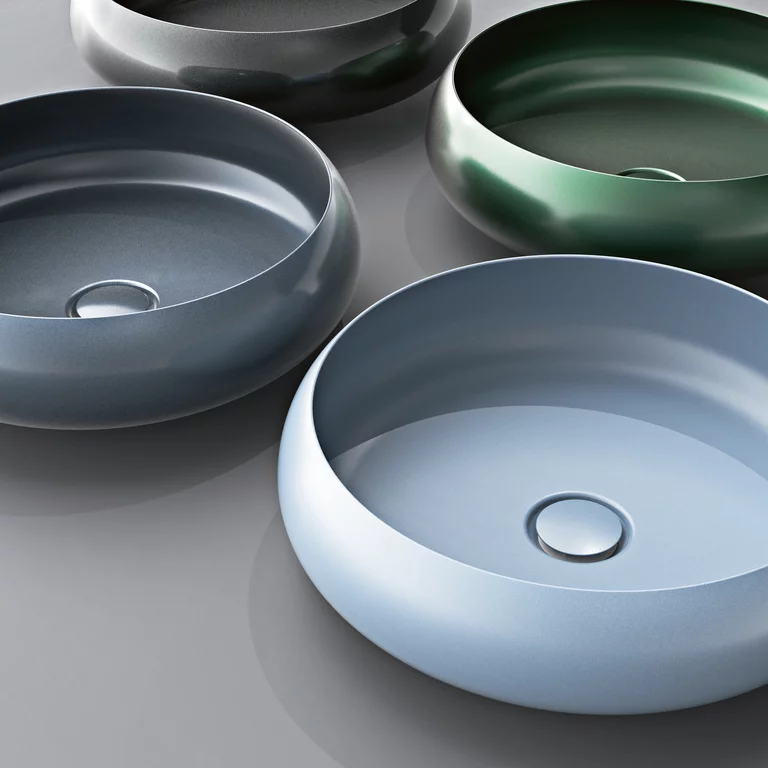
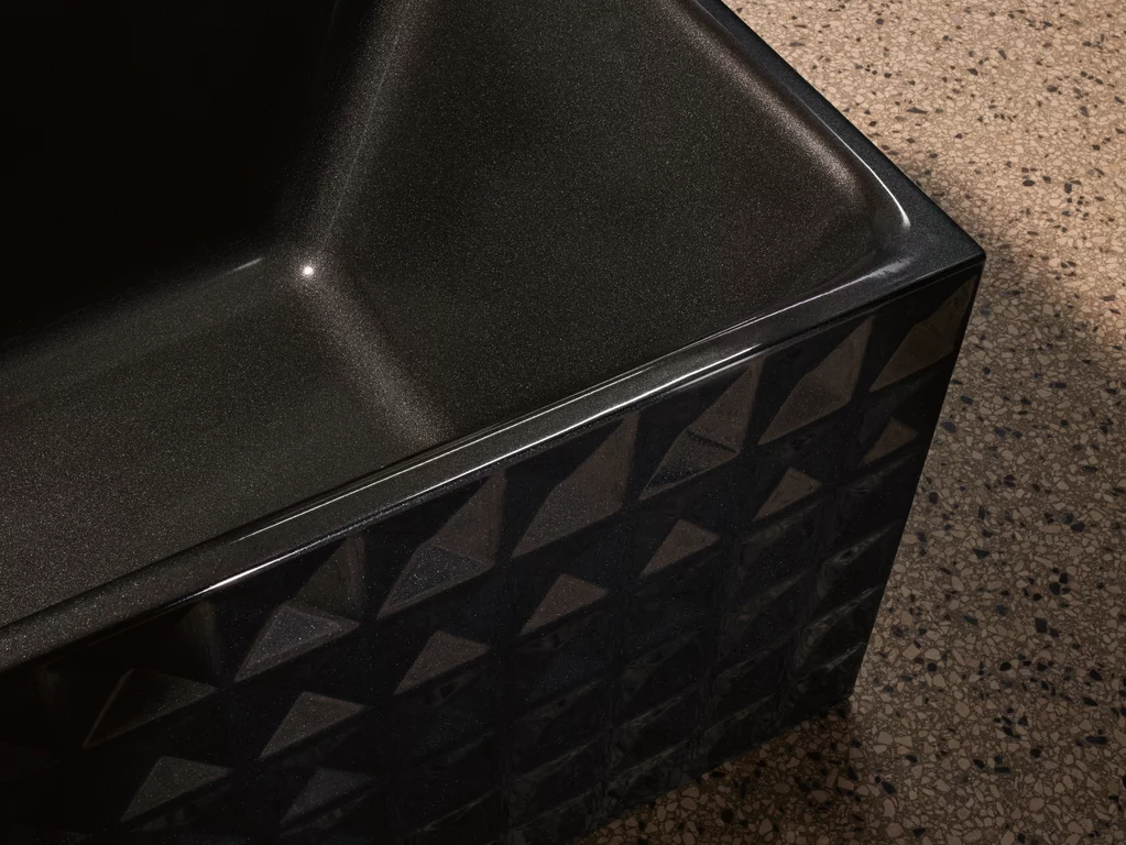
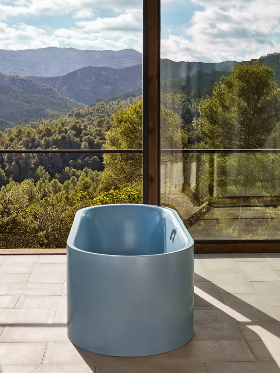
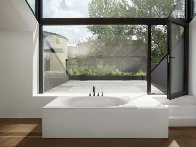
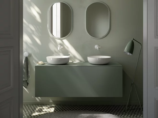
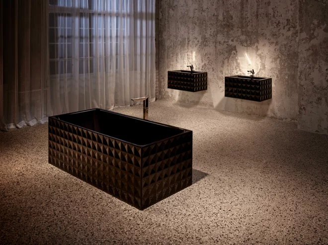
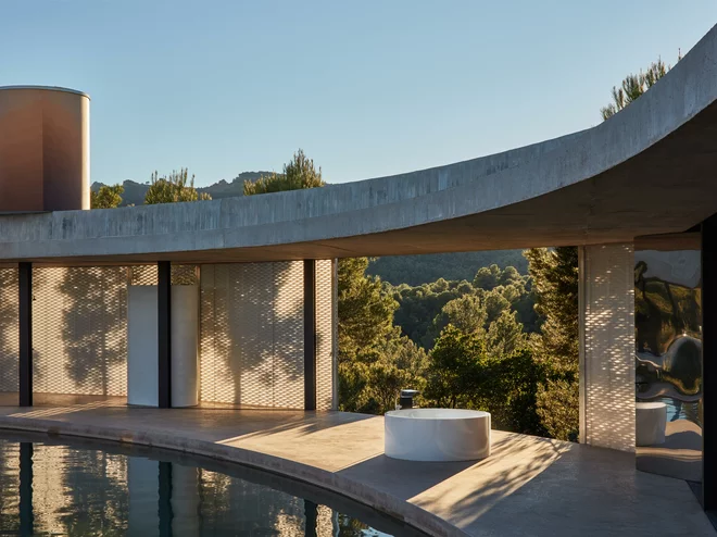
Coloured washbasins or shower surfaces provide eye-catching dashes of colour in the bathroom, and make it possible to design the architecture in an intriguing way: the spotlight can be put on the washing area by selecting the round BetteCraft washbasin in luminous green or a soft shade of blue. Eye-catching contrast or effect colours such as the Midnight black glitter colour or the Forest changing colour present individual bathroom elements as coloured eye-catchers which shimmer in an exciting way depending on the light incidence. The glazed titanium steel, brought superbly into shape by Bette, is therefore given attractive visual depth. "Our goal is to not only use colour as a decorative element, but support the spatial effect of our products by means of the colour selection", confirms Sven Rensinghoff.
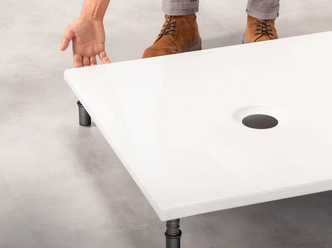
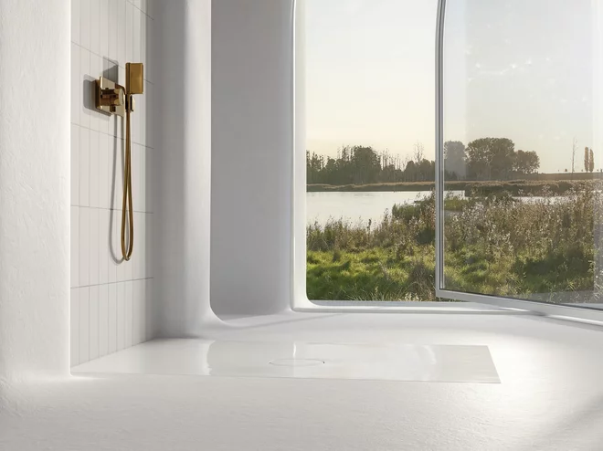
However, colour in the bathroom does not automatically mean brightly coloured. Timeless, discreet shades and pastel colours are in fashion. Anthracite, beige and grey shades and shades of fine earth and sand are also high up on the popularity scale, since they radiate a well-being and calming effect and convey a natural cosiness. More than 40 percent of Bette customers now choose coloured floor-level shower surfaces made from glazed titanium steel.
Key colours leave nothing to be desired
Sometimes, customers also require a special individual colour shade that cannot be found in the Bette colour palette. In high-value construction projects, for example – such as the planning of premium hotels. Here Bette gives architects and bathroom planners the opportunity to create their own colours with its Key Colours for orders above a certain value.
The company provides an overview of its entire range of colours at https://www.my-bette.com/en/inspiration/farben. As well as an extract of the 400-plus sanitary colours (in shiny and matt) there are also four effect colours. This results in a wide range of advisory and design approaches for planners.